NEO Electronics Brand Kit
A full brand identity system for a digital electronics marketplace - built to convey modern trust, speed, and digital ease from first glance.
The Starting Point
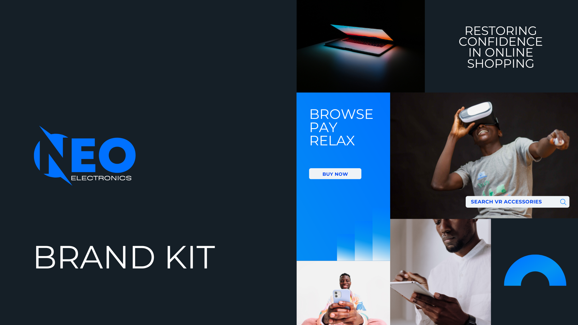
NEO Electronics launched as a digital marketplace bringing together a massive variety of gadgets, home appliances, personal electronics, and accessories - all in one place. Their promise was simple: browse, pay, and relax, knowing your order would arrive fast and secure.
But a strong operational promise needed an equally strong visual identity. NEO had the platform vision but no brand system to communicate trust, speed, and modernity to its audience of students, gamers, and professionals.
The Challenge
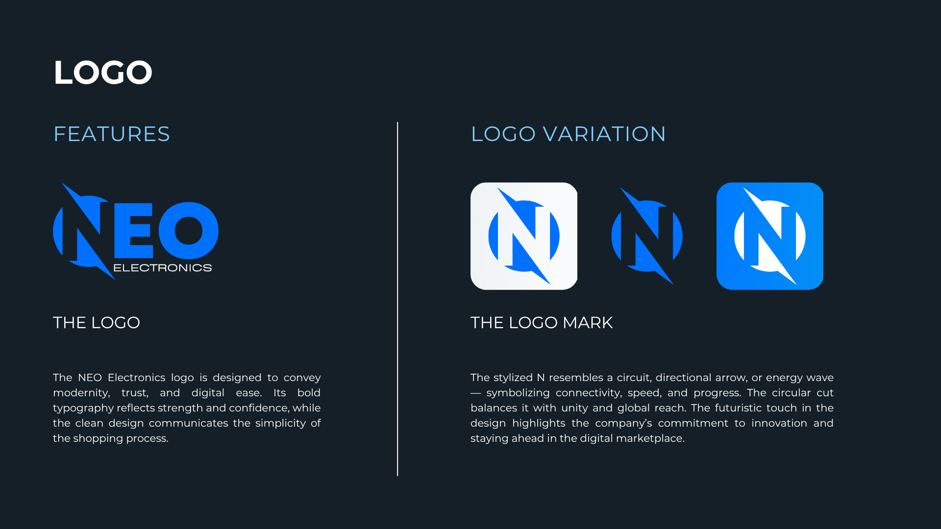
In the crowded electronics e-commerce space, NEO needed to stand out immediately. The brand had to feel tech-forward and innovative without being cold, and trustworthy without feeling corporate or stiff. Every visual element had to reinforce the core message: shopping here is fast, secure, and easy.
Logo Design
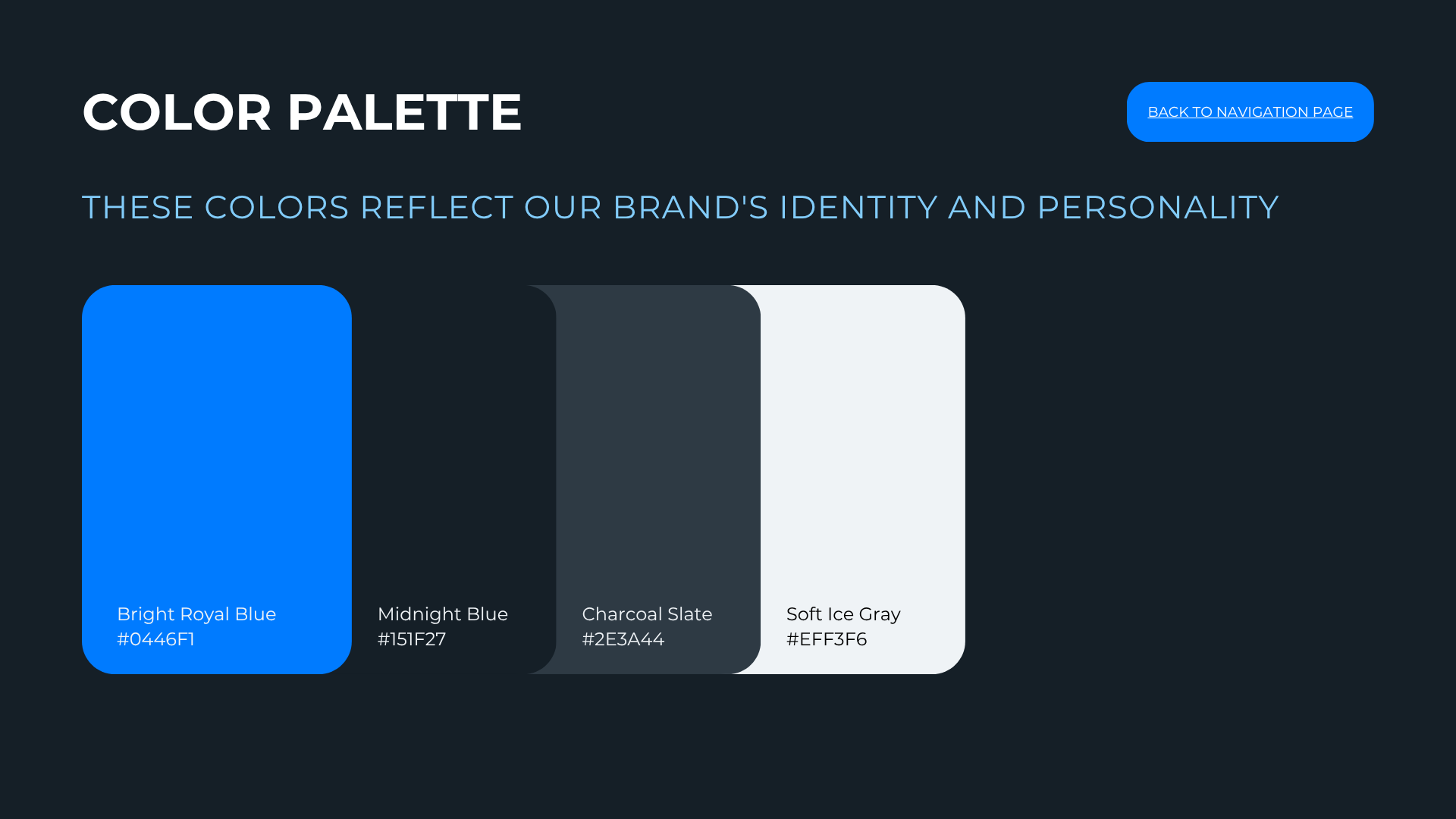
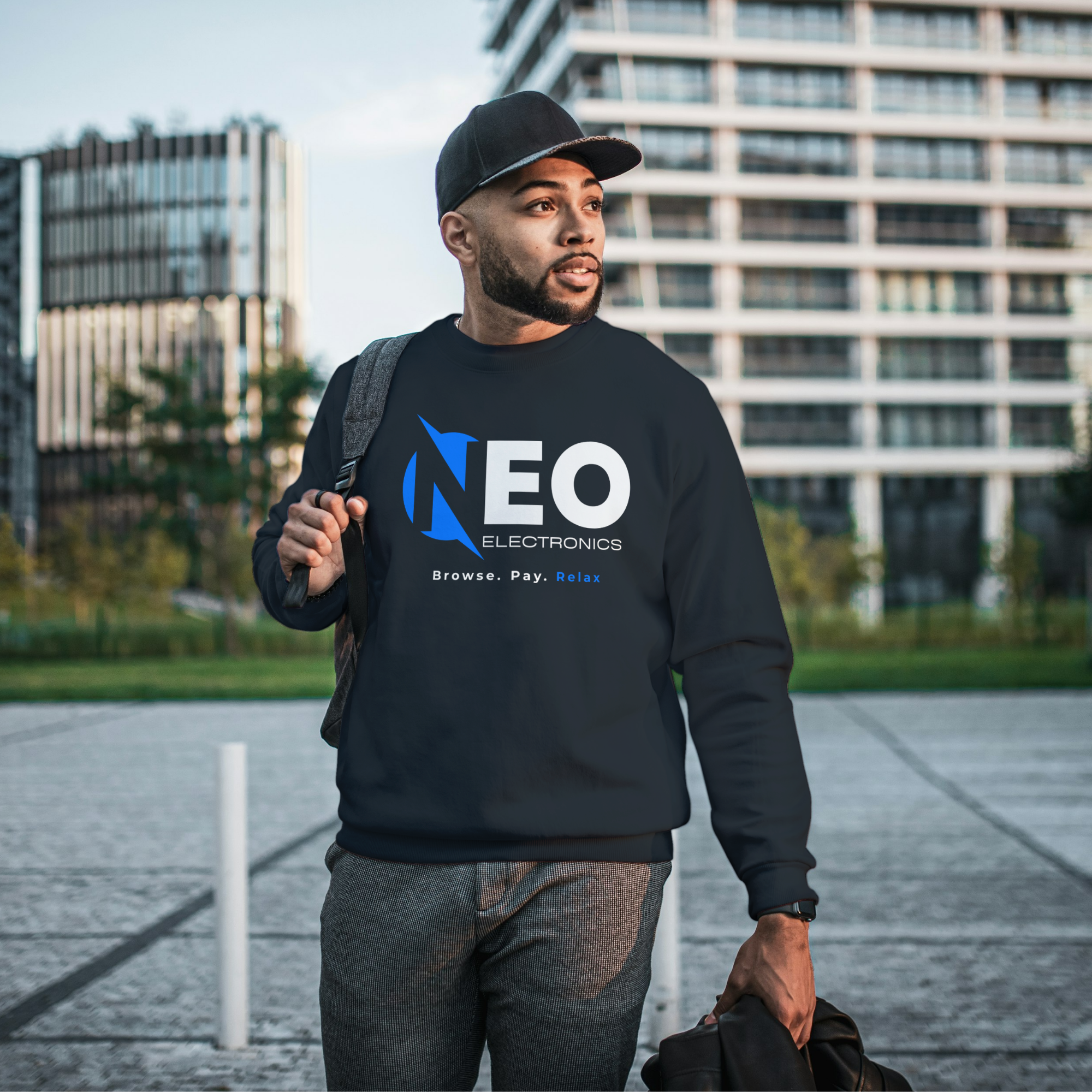
The NEO Electronics logo is built on bold typography that projects strength and confidence, paired with clean design that communicates the simplicity of the shopping process. The stylized "N" mark resembles a circuit, a directional arrow, and an energy wave - symbolizing connectivity, speed, and progress. The circular cut balances it with a sense of unity and global reach, while the futuristic touch highlights the company's commitment to innovation.
Inspiration
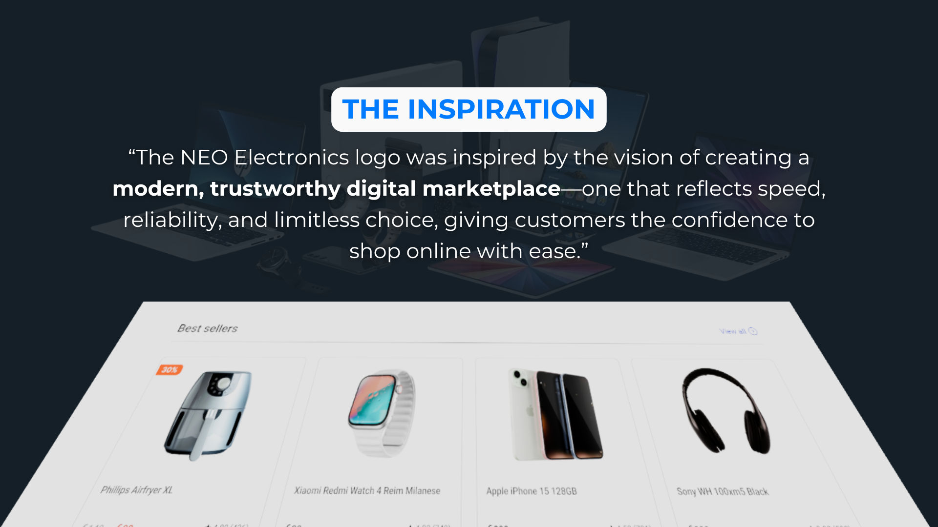
The visual direction was inspired by the intersection of technology and accessibility - clean lines, bold colour contrasts, and a sense of motion that mirrors the speed of modern e-commerce. The aim was to create a brand that felt as fast and seamless as the shopping experience NEO promised.
Colour Palette
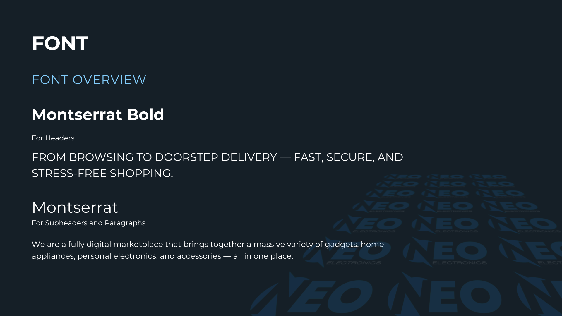
Bright Royal Blue (#0446F1) leads as the hero colour - bold, confident, and modern. It drives buttons, CTAs, and headers, conveying trust and speed. Deep Midnight Blue (#151F27) anchors backgrounds and footers with a sleek tech vibe. Charcoal Slate (#2E3A44) handles body text with sophistication. Soft Ice Gray (#EFF3F6) provides clean, airy space for cards and sections.
Typography
Montserrat Bold powers headlines with a strong, confident presence, while Montserrat in regular weight handles subheaders and body copy with clarity and readability. The system is clean, modern, and tech-focused - equally at home on product pages, marketing banners, and mobile interfaces.
Brand Applications
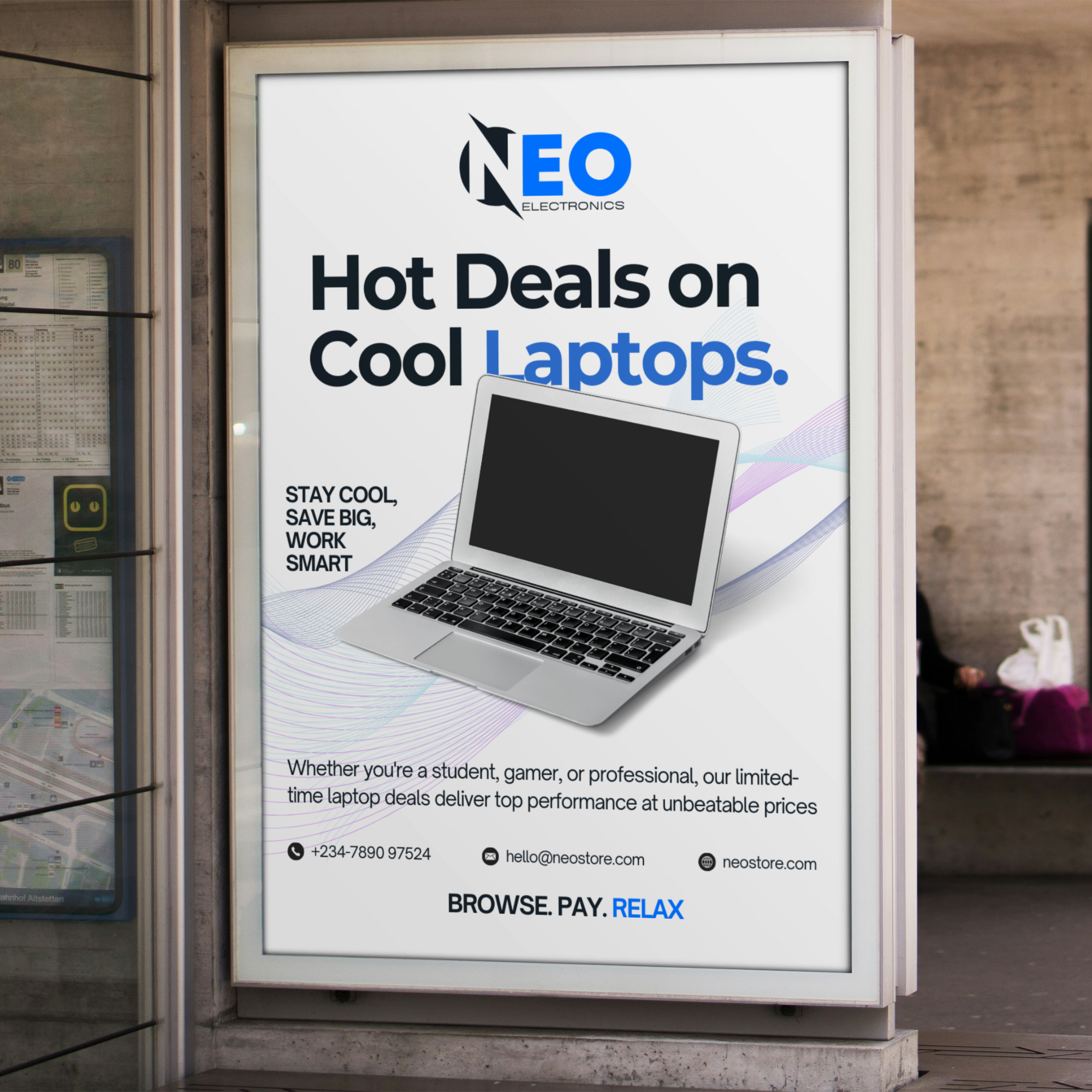
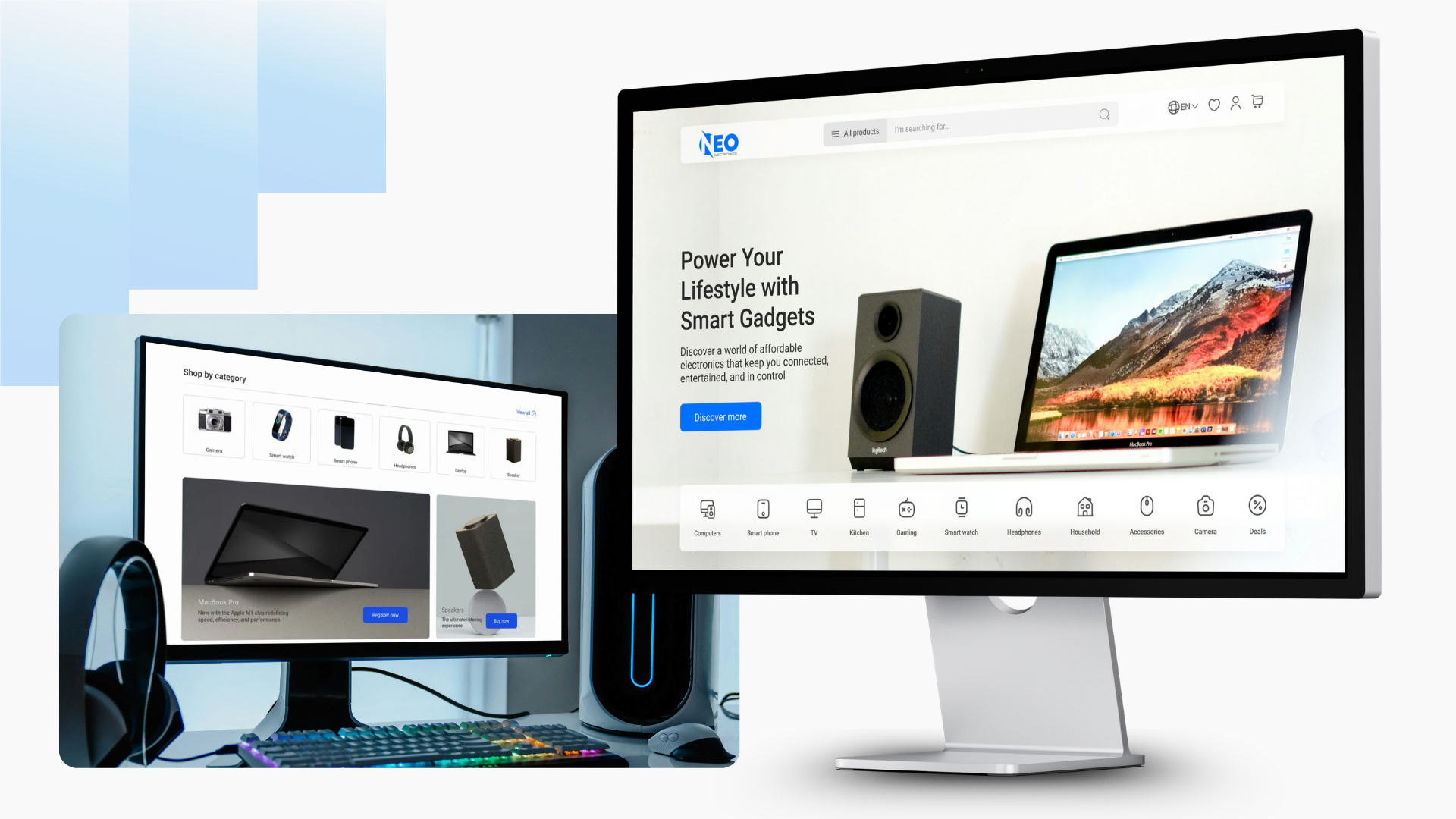
The identity was extended across website UI, mobile app screens, and marketing materials. Every application follows a consistent hierarchy: Bright Royal Blue for interactive elements and emphasis, Deep Midnight Blue for structural backgrounds, Charcoal Slate for readable body copy, and Soft Ice Gray for breathing room. The result is a cohesive, premium feel that works across digital and print touchpoints.
What It Taught Me
NEO reinforced that a brand identity for an e-commerce platform is not just about looking good - it is about removing friction from the decision to trust. Every colour, font, and spacing choice either builds or erodes confidence. The most successful decision was leading with a bold, unconventional blue that stood out against the sea of red-and-black electronics brands while still feeling solid and dependable.