iCare - Hospital Management App Design
iCare is a hospital management mobile app design created to make healthcare interactions easier to navigate for patients and medical teams.
Overview
iCare is a mobile app design for hospital management, focused on simplifying the everyday interactions between patients, doctors, and healthcare facilities.
The design brings important actions into a clean mobile experience, including appointment access, patient information, doctor discovery, care updates, and communication touchpoints.
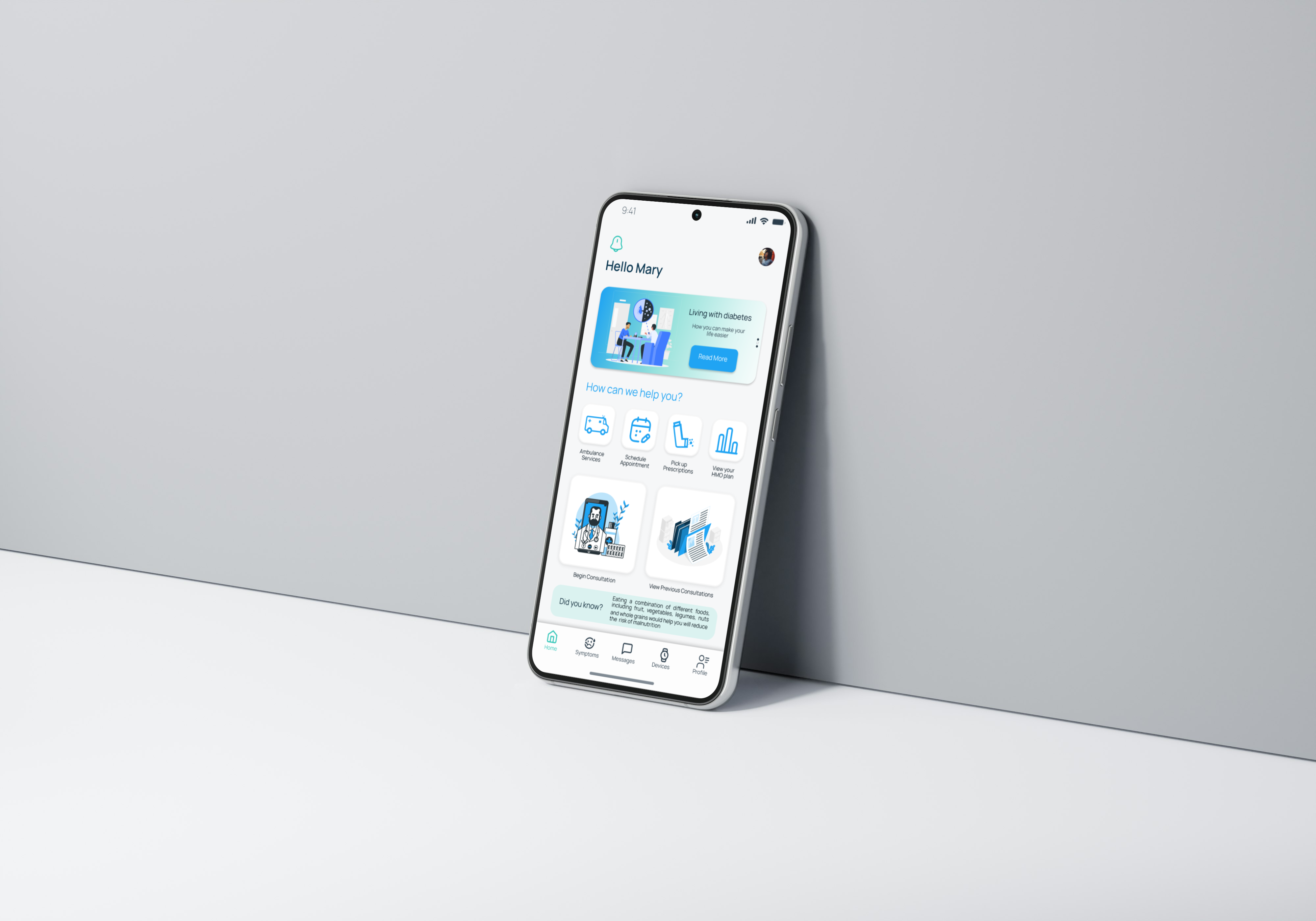
The cover introduces the product direction: a healthcare experience that feels calm, organized, and accessible. The goal was to make hospital-related tasks feel less intimidating by giving users a simple starting point and clear visual hierarchy from the first screen.
At a product level, the app is built around the idea that hospital interactions are usually time-sensitive and emotionally loaded. A patient may be trying to find a doctor, confirm an appointment, check care information, or understand what to do next. The interface therefore needed to reduce confusion, avoid visual noise, and make each next step feel obvious.
What the Cover Represents
The first visual is a high-level presentation of the iCare product direction. It is not just a decorative cover; it sets the expectation for the rest of the design system. The rounded interface elements, soft color palette, and clean spacing were chosen to make the product feel modern, approachable, and dependable.
For a healthcare product, trust is part of the user experience. The visual language avoids aggressive contrast or clutter because the product should feel like a calm assistant, not another complicated system the user has to decode.

Screen Flow
The screen set shows how the product moves from entry points into practical healthcare tasks. The design explores core moments such as onboarding into the app, finding relevant medical services, viewing doctor or hospital information, and moving toward appointment-related actions.
Each screen was treated as part of a larger care journey. Instead of designing isolated UI shots, I considered what the user might need before and after each screen: reassurance, context, a clear action, and enough information to continue without feeling overwhelmed.
Design Direction
Healthcare apps need to feel trustworthy and easy to use. The iCare interface uses simple navigation, readable layouts, and direct task flows so users can find what they need quickly, even in stressful moments.
The visual language is intentionally calm and structured, helping the product feel professional while keeping the experience approachable for a wide range of users.
I focused on reducing the number of decisions users have to make at each step. Key actions are grouped around familiar healthcare needs, while supporting details stay close enough to help without making the interface feel crowded.
The layout system uses generous spacing, large touch targets, and predictable card structures. This helps the app work for different kinds of users, including people who may not be highly technical or who may be using the app while under pressure.
Product Decisions
The main product decision was to keep the app focused on the highest-frequency healthcare interactions instead of trying to show every possible hospital feature at once. Appointment access, doctor discovery, patient information, and care updates became the foundation because they represent the actions most users would need repeatedly.
I also designed the experience to feel modular. Each major task can stand on its own, but the visual treatment keeps the whole app consistent. This makes the concept easier to scale into more advanced hospital-management features later.
What It Shows
This project highlights mobile UI design for a healthcare product: organizing complex information, prioritizing key actions, and creating a smoother path through appointment and care-management tasks.
It also shows how product context shapes interface decisions. A hospital app has to support trust, speed, and clarity at the same time, so the design avoids unnecessary decoration and uses spacing, structure, and direct labels to keep the experience easy to follow.
For the reader, the important thing to notice is how the design balances emotional tone and practical utility. The interface is soft enough to feel human, but structured enough to support real healthcare workflows.