The Ayodell Group Brand Kit
A full brand identity system for a diversified Nigerian conglomerate operating across importation, manufacturing, and consultancy - built to project authority, clarity, and trust at every touchpoint.
The Starting Point
The Ayodell Group is a dynamic Nigerian conglomerate based in Port Harcourt, operating at the intersection of global trade, local production, and expert strategy. Their three core divisions - seamless importation, state-of-the-art manufacturing, and insightful consultancy - serve as vital bridges connecting Nigerian businesses to global markets.
Despite a strong operational foundation, the group had no unified visual identity. Each division operated independently, and there was no consistent brand language to communicate their combined strength, credibility, and ambition.
The Challenge
The core challenge was balancing three distinct business verticals under one parent brand. Importation needed to feel global and connected. Manufacturing needed to feel industrial and precise. Consultancy needed to feel strategic and forward-looking. The identity needed to speak to all three without fragmenting.
On top of that, the brand had to project authority in Nigeria's competitive B2B landscape while remaining approachable enough to build trust with new partners and clients.
Logo System
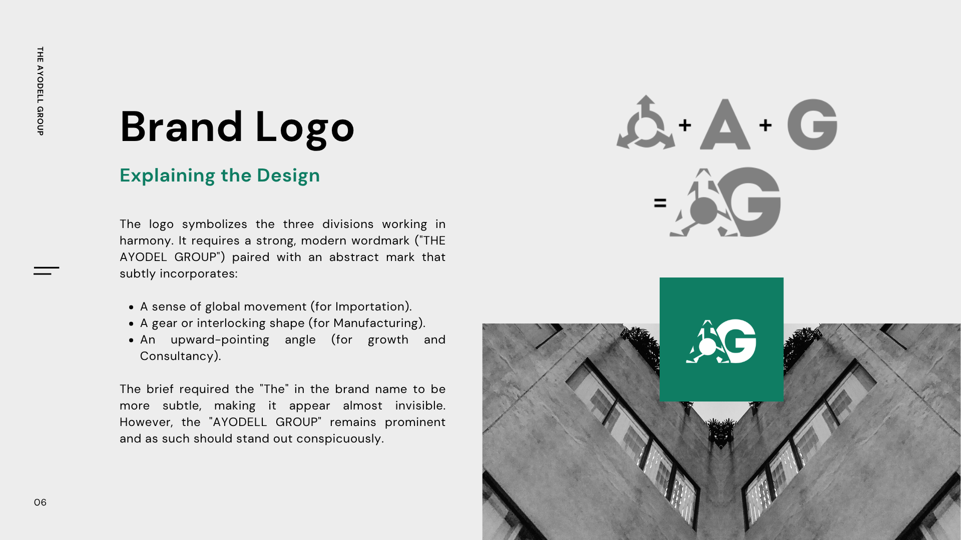
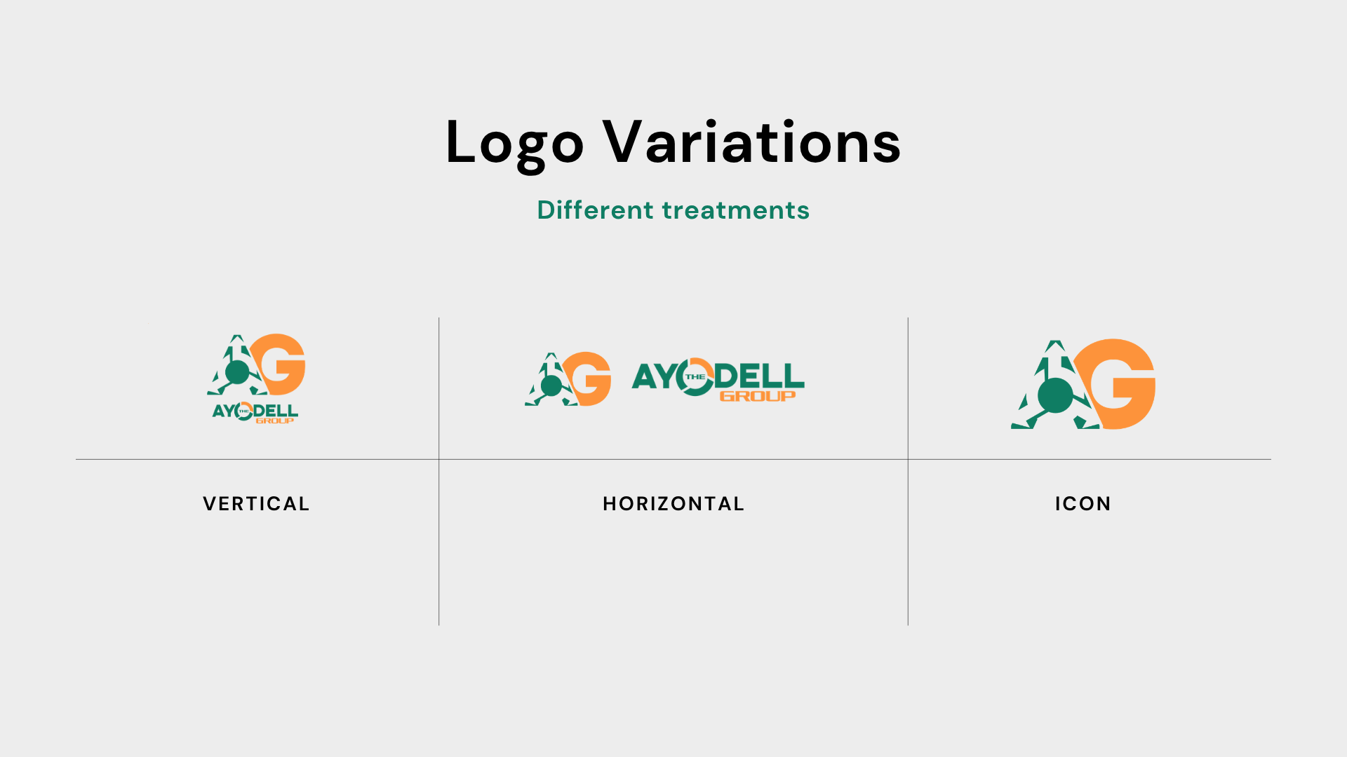
The logo centres on a strong, modern wordmark - "THE AYODEL GROUP" - paired with an abstract mark that subtly incorporates three symbolic elements: a sense of global movement representing Importation, a gear or interlocking shape representing Manufacturing, and an upward-pointing angle representing growth and Consultancy.
A deliberate design decision was made to keep "THE" subtle and almost invisible, allowing "AYODELL GROUP" to stand prominently. The full system includes horizontal, vertical, and icon-only variations to ensure flexibility across every application.
Colour Palette
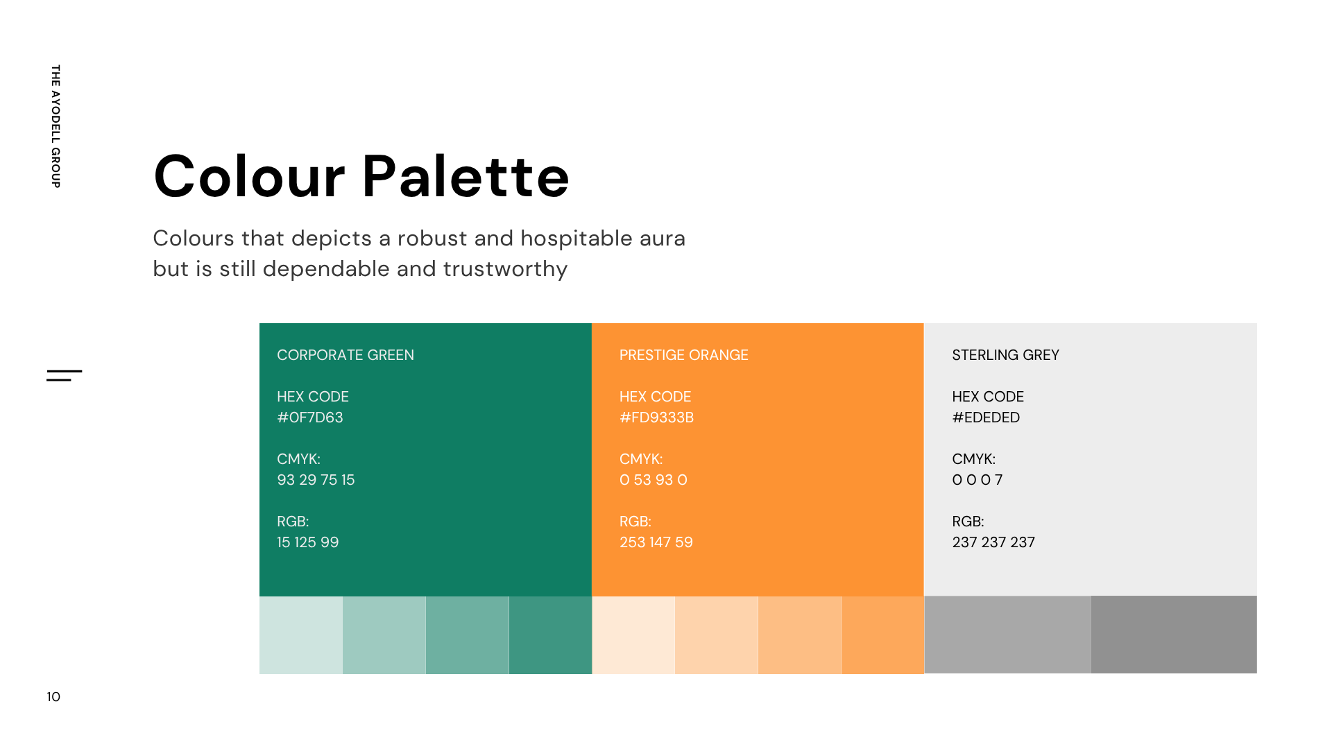
The palette was built to convey a brand that is both robust and hospitable - dependable yet warm. Corporate Green (#0F7D63) anchors the system with a grounded, professional authority. Prestige Orange (#FD933B) injects energy and approachability. Sterling Grey (#EDEDED) provides a clean, neutral foundation that lets the other colours breathe.
Typography
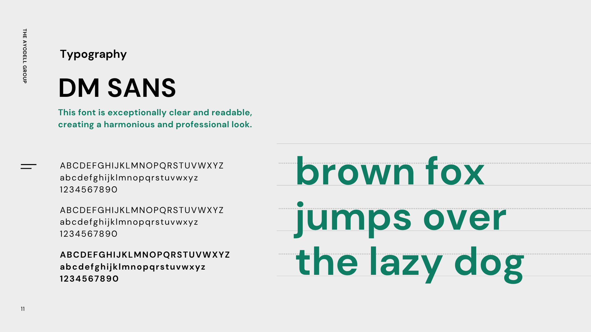
A clean sans-serif typeface was chosen for its exceptional clarity and readability. The font system creates a harmonious, professional look across all brand communications - from corporate documents to digital interfaces - ensuring consistency whether on a letterhead, a website, or a factory sign.
Brand Voice
Professional & Authoritative - As experts in their field, the language is confident, knowledgeable, and direct. Insightful & Clear - Complex ideas are communicated with clarity and purpose, avoiding jargon while providing value. Trustworthy & Reliable - The tone is steady, honest, and dependable, saying what it means and delivering on promises.

Brand Applications
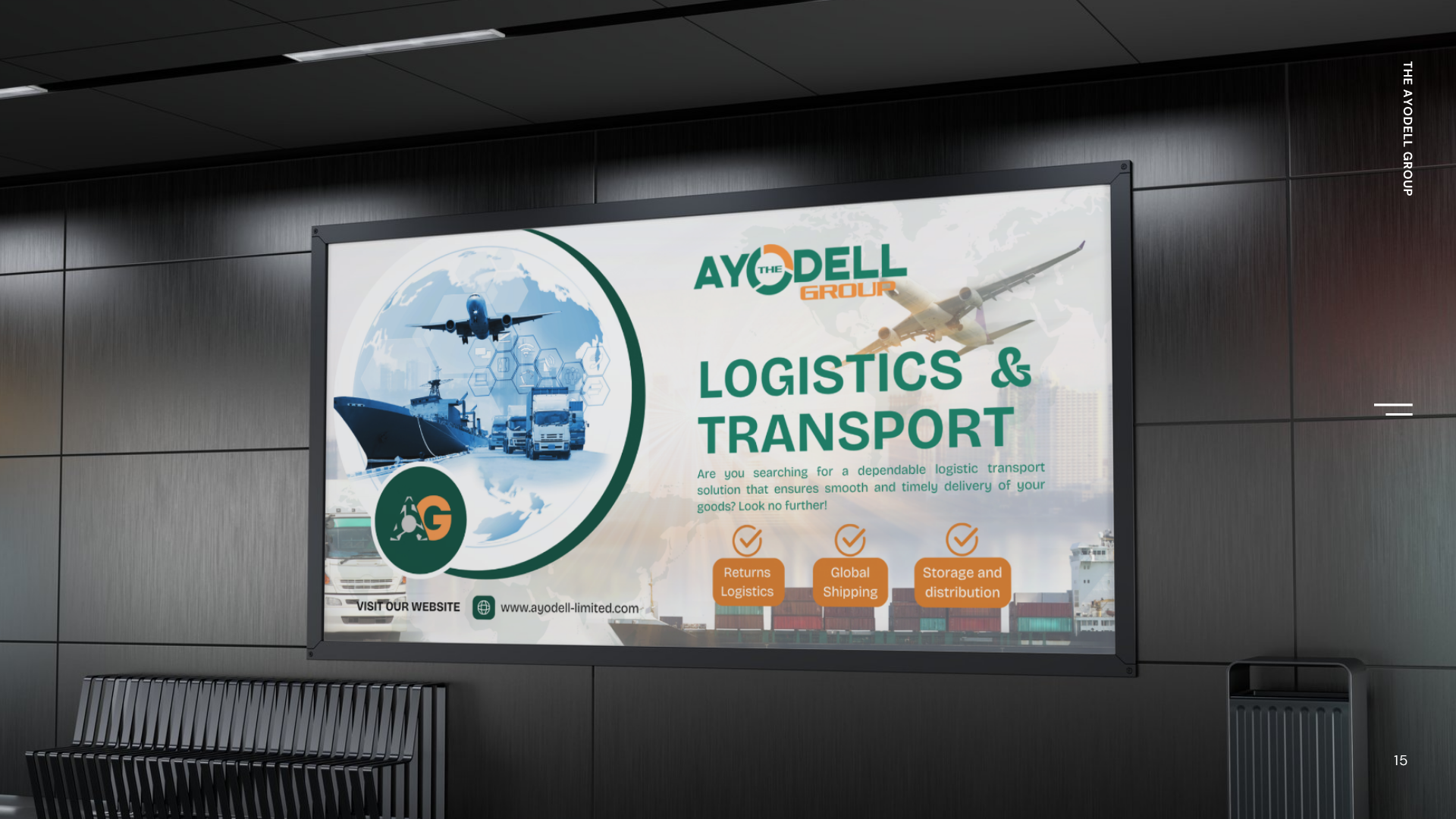
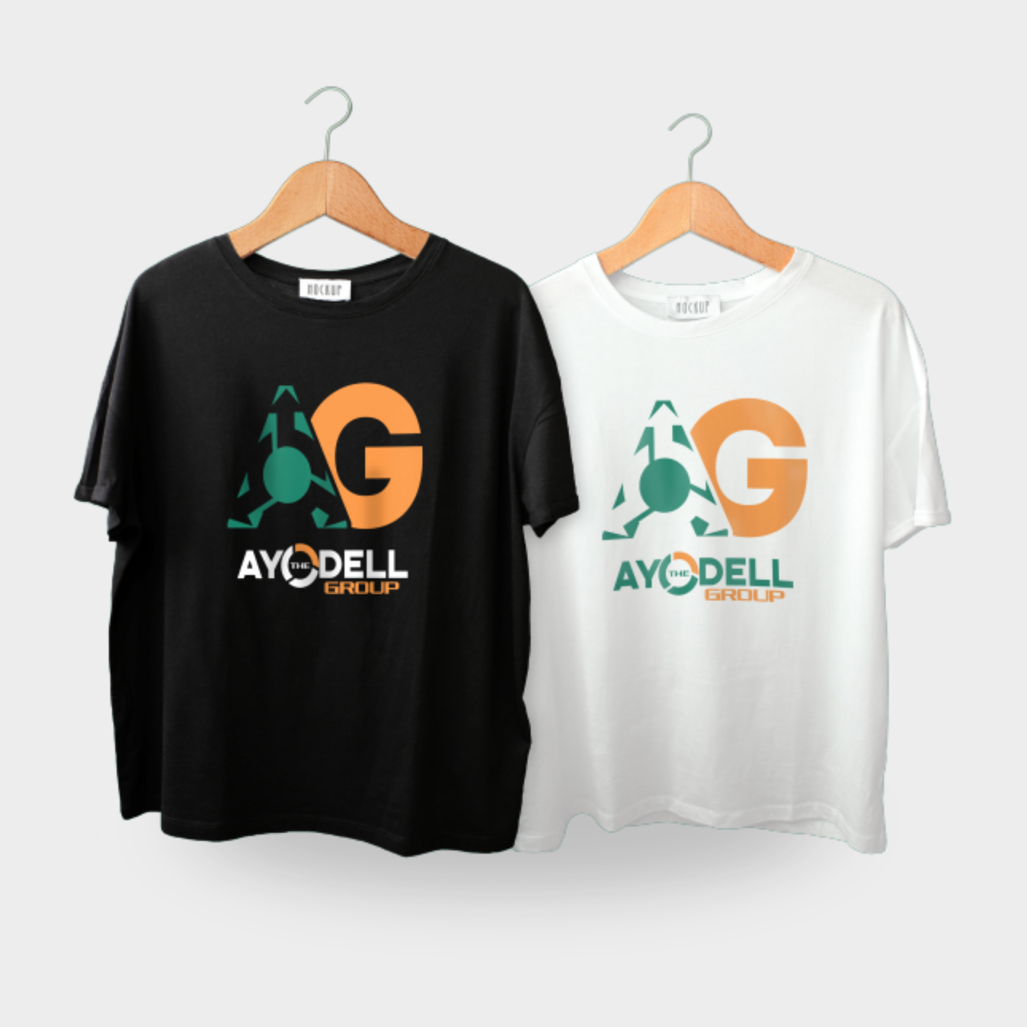
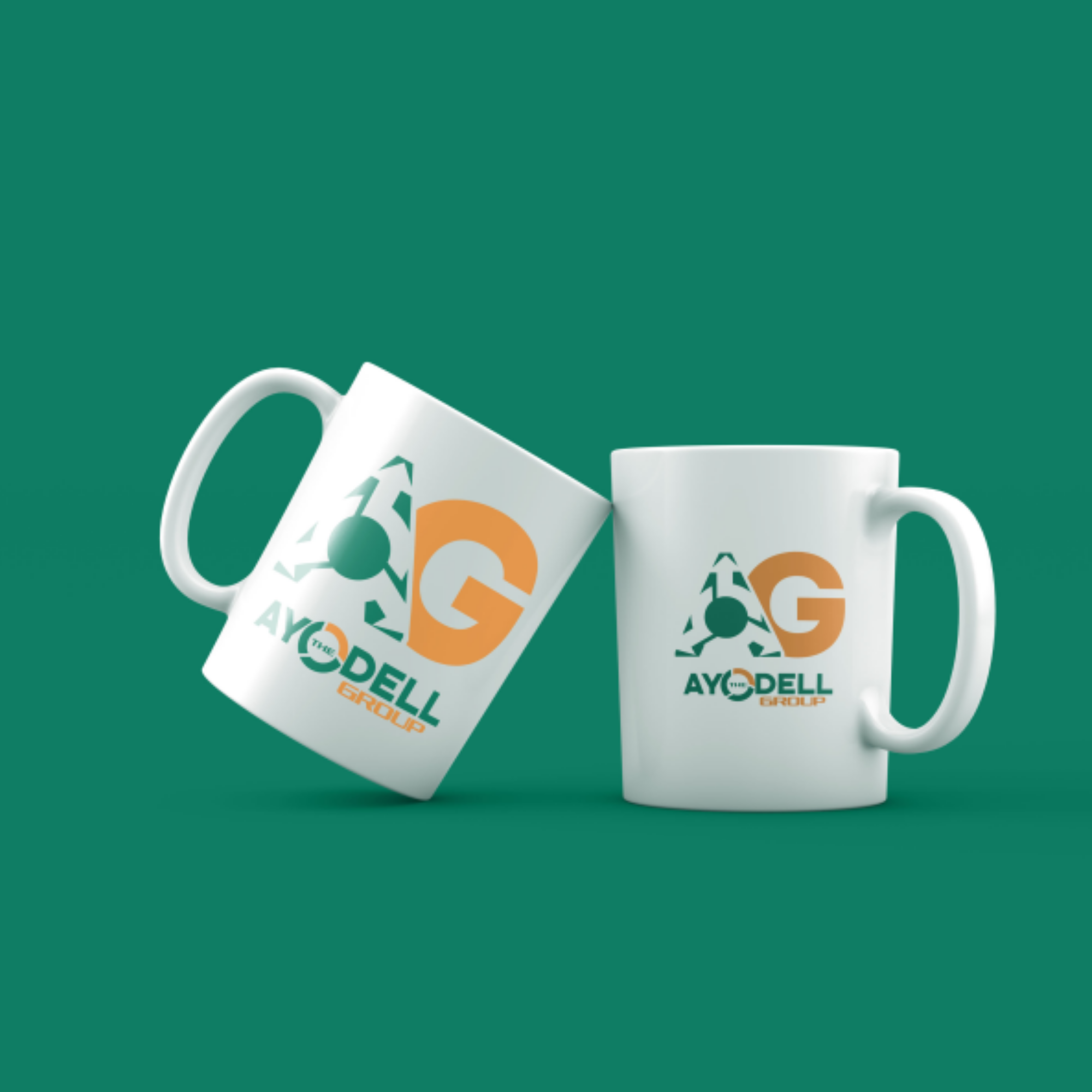
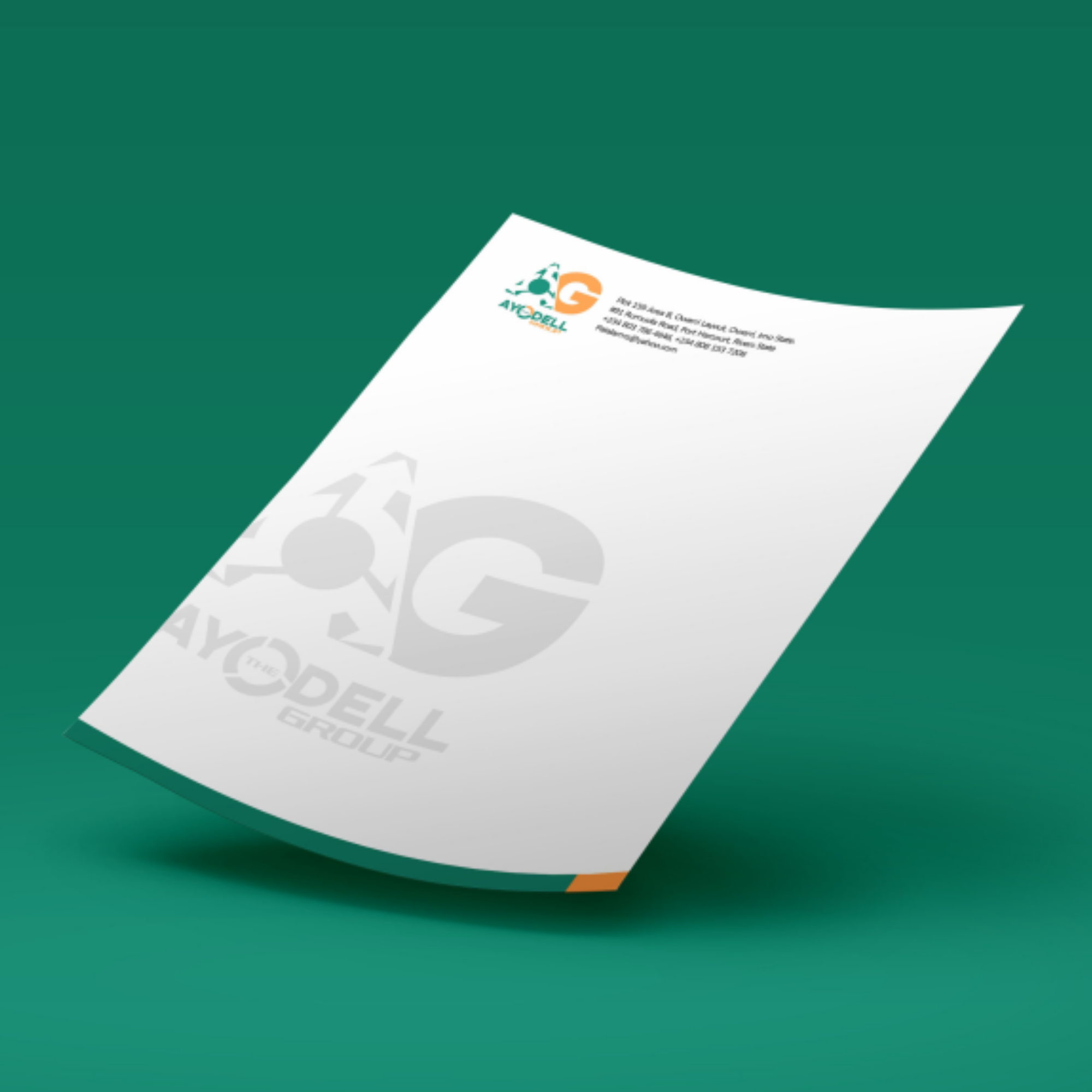
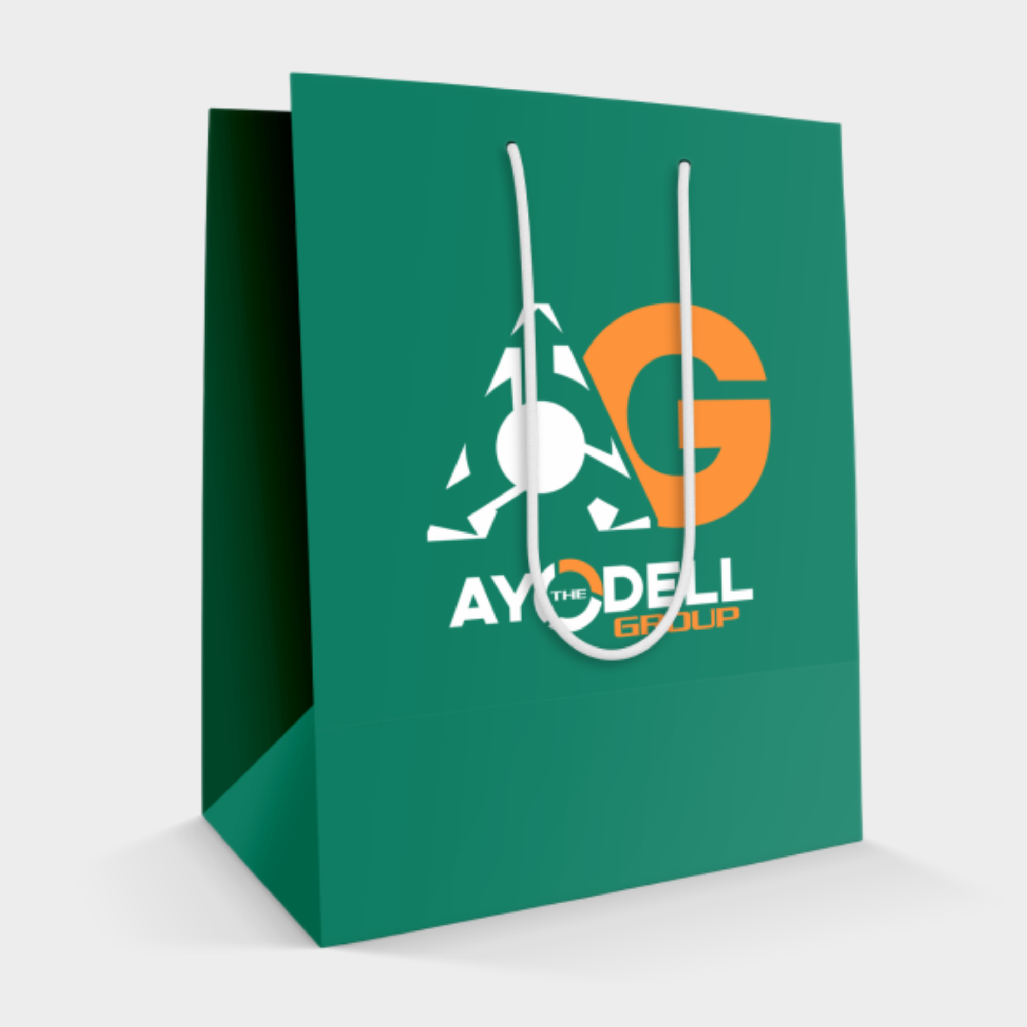
The brand system was extended across a full range of corporate and physical assets. On corporate materials - business cards, letterheads, and digital signatures - the logo is prominent yet elegantly placed for immediate recognition. For physical assets such as building signage, vehicle branding, and factory equipment, the identity scales for high visibility and real-world impact. Social media templates and digital presentations complete the ecosystem.
What It Taught Me
Building a brand for a multi-division conglomerate is a lesson in restraint and intentionality. Every design decision - every colour, every spacing choice, every typographic detail - had to work for three different audiences across importation, manufacturing, and consultancy without creating visual confusion.
The breakthrough came from finding the overlap between the three divisions: reliability, precision, and forward motion. Once those became the emotional anchors of the brand, the visual system naturally fell into alignment.
Brand Guide Spread
A full look inside the brand guide document, showing how the logo system, colour palette, typography, exclusion zones, and application guidelines come together into a single reference that any team or partner can follow.