The Future of Digital Design - Trends to Watch
Published
June 19, 2026Have you noticed how so much of the internet is starting to look exactly the same?
For a long time, digital design chased absolute perfection. We fell in love with smooth, sterile templates, soft grey text, and hyper-polished layouts. But now that anyone can generate a clean layout or an image in seconds, our eyes are getting a bit tired of "perfect."
As we look ahead, the biggest shift in digital design isn't about flashy tech or complex code. It's actually a rebellion against the sterile and identical. We are entering an era of design that is warmer, a bit more human, and intentionally raw.
Here are three major trends shaping the future of how we experience screens.
1. The Human Touch (Embracing the Imperfect)
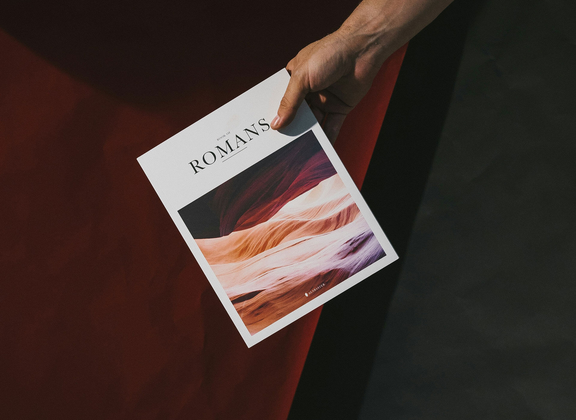
When everything on the web looks machine-made, the best way to stand out is to show your fingerprints. We're seeing a massive wave of organic imperfection making a comeback.
- What it looks like: Think hand-drawn doodles, scribble-style typography, textures that look like real paper or film grain, and layouts that feel more like a physical magazine or "zine" than a rigid grid.
- Why it matters: It instantly signals authenticity. It tells the user, "A human built this for you, not an algorithm."
2. Bold Minimalism & Clean Geometry
Minimalism isn't going away, but it's toughening up. The era of blurry drop-shadows and pill-shaped corporate soft-UI is fading out. In its place is a style often called tactile brutalism.
- What it looks like: Sharp right angles, crisp 1px borders, and ultra-clean layouts. Instead of hiding structure, designs are proudly showing their wireframes.
- The twist: It's being paired with bold, high-contrast color choices and confident, massive typography that stretches across the screen. It looks structured and premium, but never boring.
3. "Micro-Delights" Over Heavy Animation
Giant, heavy 3D graphics that slow down your browser are taking a backseat to performance and accessibility. The future is all about subtle, meaningful motion.
- What it looks like: A button that has a satisfying, springy bounce when you hover over it. A form field that reacts gently when you type. A subtle layout shift as you scroll down a page.
- Why it matters: It keeps websites lightning-fast while making the digital space feel interactive and alive. It proves that good design doesn't need to shout to be memorable.
The Takeaway: The future of design isn't about what tools can do automatically; it's about how we use those tools to create an emotional connection. Clean, structured, and unapologetically human - and that's where we're heading.